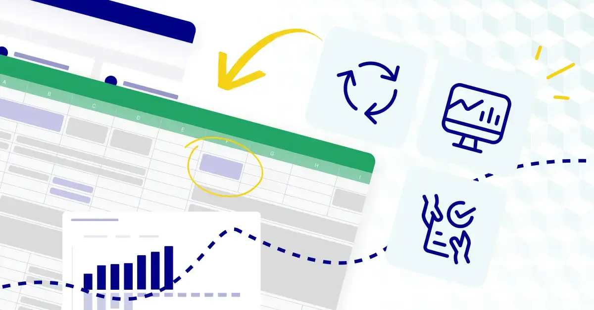
What is a finance dashboard?
A financial dashboard is a flexible business intelligence tool that aids in streamlining the functioning of your company. Similar to a dashboard in a car, a financial dashboard allows you to view important information at a glance through intuitive data visualization. Instead of monitoring speed and gas on a joyride, you're viewing key metrics like customer acquisition cost and gross profit margin.
The best financial dashboards allow you to "drill down" into KPIs and gain insights. Dashboards help synthesize disparate financial and accounting data into a cohesive, easily understandable format, empowering you to make informed decisions.
However, not all finance dashboards are the same. Beyond there being different types of dashboards that focus on different metrics (e.g., dashboards that look solely at cash flow or profit and loss), not all dashboards are designed well. Let's review some of the primary types of dashboards, the metrics they contain, and step-by-step instructions for building them so they're as effective as possible.

How to build an effective financial dashboard
From defining objectives and selecting key metrics to designing visualizations and ensuring data accuracy, these steps will guide you in building a financial dashboard that delivers valuable insights and supports informed decision-making.
1. Determine the dashboard you need
As we mentioned previously, not all dashboards are the same—different dashboards focus on different metrics and cater to different target audiences.
Before you start building your dashboard, determine its objectives and identify the target audience. Understand what key metrics, insights, and visualizations are most relevant to the stakeholders who will be using the dashboard. Then, select the most important financial and non-financial KPIs that align with your organization's goals and objectives.
Here are some examples of different financial dashboards, their target audiences, and the KPIs they prioritize:
CFO dashboard
Today's CFO is a strategic partner to the CEO, helping direct company policy. However, CFOs need quick access to heaps of information to make informed decisions. This is where CFO financial dashboards come into play.
While not everything can be included in a dashboard, the CFO must have a bird's eye view of the company's financial situation. Certain metrics need to be prioritized to facilitate this, like:
- Working capital: The difference between current assets and current liabilities. Working capital is your liquidity (i.e., the money you have to work with and continue day-to-day operations). Working capital indicates your business's short-term financial health. If working capital is declining, financial professionals must consider measures like expense reduction or revenue growth.
- Cash balance: Your cash balance is the amount of money your company has. To calculate it, simply add your current cash to your previous opening balance. A healthy cash balance allows the company to manage unexpected expenses, invest in new ventures, and withstand economic downturns.
- Net profit margin: This metric shows how effectively a company turns its revenue into profit. Including net profit margin on the CFO dashboard enables CFOs to assess the performance of each business unit, product line, and segment. It helps identify areas of the business that are generating higher profit margins and those that may require attention or improvement.
- Recurring revenue: Recurring revenue is the money you'd get from subscriptions. Understanding recurring revenue provides valuable insights into your company's financial position and the strength of your customer relationships. It also aids in successfully managing cash flow.
- Cash runway: The cash runway is the time you have until your company runs out of money if income and expenses remain the same. It's directly related to the cash burn rate and gives a good overview of short-term liquidity.
- Customer acquisition cost (CAC): The customer acquisition cost is the average amount of money required to secure new customers. With this number, a CFO can intuit the effectiveness of marketing and sales strategies, the ROI of those efforts, and whether there's room for improvement. They can also identify trends and anomalies over time, helping to allocate budgets more efficiently.
- Employee retention rate: This metric measures the percentage of employees who remain with the organization over a specific period. It provides valuable insights into the effectiveness of talent management strategies, employee engagement, and the overall health of the organization. A high employee retention rate indicates a positive work environment, strong leadership, and effective HR practices, while a low retention rate may highlight issues that need to be addressed, such as poor job satisfaction, inadequate compensation, or ineffective employee development programs.
Profit and loss dashboard
The profit and loss (P&L) dashboard provides a high-level view of the company's income and expenses. Any solid P&L dashboard should include the following metrics:
- Revenue: Revenue should be broken down into different streams or categories, such as geographic region, product/service, and sales channel. This helps enable granular analysis.
- Operating expenses: Your costs to maintain business activities. Divide key operating expenses into categories such as rent, utilities, salaries, and marketing costs. This breakdown will help facilitate cost analysis, budgeting, and expense management, allowing you to identify areas for optimization and cost-saving opportunities.
- Net profit: Net profit represents the company's profit after deducting taxes and non-operating items. This is a crucial metric that reflects the bottom-line profitability of the business. Display net profit prominently in the dashboard so stakeholders can easily assess the company's overall financial health.
- Net income: Net income is sometimes considered synonymous with net profit, but it's actually a distinct metric. Net income is the amount remaining after deducting expenses, taxes, and dividends. For shareholders, this metric can be an essential indicator of the business's financial success.
- Net operating income: Net operating income (NOI) represents income generated from the core operations of the business, excluding non-operating income and expenses. Monitoring NOI within the P&L dashboard enables users to streamline operational efficiency, make informed decisions on resource allocation and cost control, and benchmark business performance against industry standards.
- Cost of goods sold: Cost of goods sold is a measure of how much profit you're making from sales when factoring in the cost of production.
Cash flow dashboard
Sticking with the car metaphor, cash is the fuel of your business—which is why the cash flow dashboard is one of the most important. The cash flow dashboard helps translate the cash flow statement visually. It should include the following:
- Cash position: Your cash position should be displayed prominently on the dashboard, near the top.
- Cash flow from operations: This metric shows the cash inflow and outflows resulting from day-to-day business activities.
- Cash flow from investing activities: This metric tracks the cash flow associated with investing activities, such as the purchase or sale of assets, investments in other businesses, or capital expenditures.
- Cash flow from financing activities: This metric captures the cash flows related to financing activities, including proceeds from debt or equity financing, repayment of loans, dividends paid, or share buybacks.
- Net cash flow: This is the bottom line on the cash flow statement, representing the difference between cash inflows and outflows over a specific period.
- Cash conversion cycle: The cash conversion cycle helps you measure how long it takes to transform inventory into cash from sales. Understanding this helps you get a better handle on inventory management and identify opportunities to optimize working capital and cash flow.
2. Gather and organize data
Gathering and organizing data for financial dashboards involves selecting data sources, collecting and validating data, preparing it for visualization, and implementing appropriate data governance and security measures. This ensures that the data within the dashboard is accurate, accessible, and up-to-date, enabling stakeholders to derive valuable insights and drive informed decision-making.
3. Choose dashboard design and visualization tools
Select a dashboard design and visualization tool that suits your needs and expertise. Consider factors such as ease of use, data connectivity, interactivity, and visualization capabilities. Ensure that the tool supports a variety of chart types, customizable layouts, and responsive design to create an effective and visually appealing dashboard.
4. Design the dashboard layout
Design your reporting dashboard to be logical and user-friendly. Organize the visualizations, charts, and graphs in a way that supports easy navigation and comprehension. Group related metrics together and ensure that the most important information is prominently displayed.
5. Select appropriate visualizations
Choose the most appropriate visualizations to represent your data. Bar charts, line graphs, pie charts, and gauges are common options for financial dashboards. Consider the nature of the data and the insights you want to convey when selecting the appropriate visual representation.
6. Apply filters and interactivity
Incorporate filters and interactivity to allow users to customize the dashboard based on their specific needs. This can include date ranges, product lines, geographic regions, or other relevant dimensions. Interactive features enhance user engagement and facilitate deeper data exploration.
7. Ensure data accuracy and real-time updates
Regularly verify the accuracy and integrity of the data presented on the dashboard. Establish processes to ensure that data is updated in a timely manner, whether through automated connections or manual data refreshes. Real-time or near real-time updates provide the most up-to-date insights.
8. Test and refine
Conduct thorough testing of the dashboard to ensure that it functions correctly and meets user expectations. Seek feedback from stakeholders and make necessary adjustments to improve usability, clarity, and effectiveness. Continuously monitor performance and user engagement to identify areas for further optimization.
Best practices for designing a strong financial dashboard
Regardless of the type, each financial reporting dashboard has the same general goal: to simplify a complicated situation. You want to be able to see all relevant data at a glance and quickly transform that information into actionable insights.
To do this, your modern financial dashboard needs to connect all these pieces of data, tell a story, and allow a user to drill down and investigate on an ad hoc basis. Whichever type of dashboard you're creating, be sure to follow some of these best practices:
Consider your audience
The audience for your dashboard determines both its content and design. Start by asking yourself who is going to use the dashboard and why. A CFO might need financial health metrics like working capital or cash runway, while a department manager may focus on operational costs or team productivity.
Once you understand your audience, tailor the dashboard to their specific needs. Each metric should help them answer a question or make a decision. The more aligned the dashboard is with their goals, the more impactful it will be.
Keep it simple
We all want to include as much information as possible, but that would defeat the purpose of a dashboard. Streamlined, business intelligence dashboards need to be focused and to the point. The best way to figure out which widgets to include is to determine what questions you want to be able to answer before designing your financial dashboard template. You should also decide who you want to be able to answer these questions, and what metrics will be most relevant to that person or group. One way to find out is to simply sit down with them and ask which KPIs they focus on most frequently.
Then, keep the dashboard uncluttered by organizing areas of relevant information. Ensure proper alignment and spacing between widgets to make the dashboard visually appealing and balanced. Use consistent margins, padding, and spacing between widgets to maintain a clean, organized appearance.
Determine goals for your finance dashboard
A dashboard without clear goals is just a collection of charts. Start by identifying what the dashboard is supposed to accomplish. Are you helping users monitor cash flow, manage expenses, or evaluate revenue growth?
Clear goals give the dashboard focus so you can determine which metrics to include, how to structure the layout, and which level of detail will be most helpful. For example, if your goal is to track liquidity, the dashboard should highlight metrics like cash position and working capital front and center.
Choose relevant metrics
Effective dashboards are built on data that drives action. Start by identifying the core objectives of your dashboard and determine which metrics best measure progress toward those goals. The right data points should offer insights that help users make informed decisions, rather than just presenting numbers for the sake of it.
For example, a financial forecasting dashboard might prioritize projected revenue, expense trends, and cash burn rate because they directly impact budgeting and strategy. Think about the bigger picture—what story should the data tell, and how will it help users take the next step?
Provide context and clarity
Use annotations and explanations to clarify the meaning of metrics, abbreviations, or calculations. You can also incorporate additional information like historical data or benchmarks to provide comparisons and insights.
The challenge is to make sure things aren't cluttered when providing this context. One way to do this is with tooltips or pop-ups that appear when hovering over a certain piece of information. The ability to "drill down" is also critical. You want each piece of financial data to lead to the next, allowing for ad-hoc investigation.
Use the five-second rule
The five-second rule is the ultimate test of how well-designed your dashboard is. Can you look at it for five seconds and remember the gist of what it was saying? Will your target audience be able to answer their most frequently asked questions in about five seconds?
For example, let's say you're designing a CFO dashboard. The CFO should be able to ask and answer "What's the company's current cash position?" or "What are our current debt levels?" in no more than five seconds.
Use the right visualizations
Visualization is the key to quickly conveying information in a dashboard. Which type of presentation you use depends on the information you want to provide. For example, if you want to compare two metrics, such as different categories of spending, you'd use bar charts. Showing trends over time, like revenue growth, would necessitate line charts, while scatter plots would be useful for showing relationships between two variables (e.g., sales revenue and advertising spend).
A good rule of thumb is to have at least five visualizations. Any more than 10 is starting to push it and can become too cluttered. If you find you have too much information, you might want to consider creating a separate dashboard.
Use colors carefully
Colors should guide the viewer’s eye without overwhelming them. Use a consistent color palette to group related data and highlight differences, such as revenue versus expenses. Limit your use of bright or contrasting colors to emphasize key insights. For example, you might use green to show positive trends and red for areas that need attention.
Avoid using too many colors since they can make the dashboard harder to interpret. You may also want to consider choosing colors based on accessibility—you might choose blue and orange rather than red and green.
Implement consistent labeling and data formatting
Consistency in labeling and formatting prevents confusion and ensures the data is easy to understand—not just for users, but also for the software and tools processing the information. Use clear, concise labels for all metrics and stick to one format for numbers, dates, and units throughout the dashboard to ensure seamless integration with reporting tools and automated systems.
For instance, if you’re displaying currency values, decide whether to round to thousands or show exact amounts and apply that consistently. Standardized formatting helps maintain data integrity across platforms, builds trust in the insights presented, and makes the dashboard feel polished and professional.
Add interactive features
Interactive features let users explore the data in ways that are most useful to them. Filters for time periods, regions, or product categories make it easier to focus on specific questions.
Drill-down options add even more flexibility. For example, clicking on a revenue metric might open a detailed breakdown by product or region. Interactivity transforms static dashboards into dynamic tools for decision-making.
Structure your dashboard
A dashboard needs to have a logical structure, which means grouping related widgets. Categorize widgets in your own financial dashboards by relevance and similarity. This will make it easier for users to quickly find the financial data they need. You might have a group of widgets related to sales, another group for marketing, and so on.
Present the most important widgets in their own separate space. They should "pop out" of the dashboard, being the most noticeable elements. To make them stand out, assign them a color that contrasts strongly with the background of the dashboard and the other widgets.
Present information in a visual hierarchy, placing the most important information at the top. You can place trends right beneath this top-level information, adding context to those data points. The most granular details should be at the bottom. This follows the idea of progressive disclosure—the idea that the simplest information should be displayed first, and become more and more detailed as the reader continues.
Another way you can structure your dashboard is by numbering different visualizations. You're telling a story with a dashboard, and that story needs to be in a logical order.
Examples of finance dashboards
Finance dashboards come in many forms, each tailored to specific needs and objectives. Whether you're tracking cash flow, visualizing profit and loss (P&L) data, or monitoring KPIs, the most impactful dashboards provide clarity, insights, and actionable information.
To help you get started, here are practical examples of finance dashboards built to make your work easier.
1. Budget vs. actuals dashboard
This dashboard is designed to compare projected budgets with real-world spending, helping businesses track financial performance and identify discrepancies. By visualizing budget variances, this dashboard enables finance teams to pinpoint overspending, underutilized resources, or unexpected cost savings.
Key metrics often include total budget, actual expenses, variance percentages, and category-specific breakdowns.

Explore the budget vs. actuals dashboard template
2. Cash flow dashboard
A cash flow dashboard provides a real-time view of a company’s liquidity by tracking cash inflows, outflows, and overall cash runway. This dashboard is essential for financial teams to monitor short-term financial health, ensuring the business can meet its obligations and plan for future expenses.
Key metrics often include net cash flow, operating cash flow, accounts receivable and payable, and cash runway projections. Visualizations like trend lines, cash balance forecasts, and breakdowns of recurring expenses help teams quickly assess financial stability.

Customize the cash flow dashboard template
3. KPI dashboard
A KPI dashboard serves as a central hub for tracking key performance indicators, offering both high-level insights and granular details on operational and financial performance. By consolidating critical metrics in one place, this dashboard helps businesses monitor progress toward goals, identify trends, and make data-driven decisions.
Common KPIs include revenue growth, profit margins, customer acquisition costs, return on investment (ROI), and operational efficiency metrics. Customizable visualizations—such as scorecards, trend graphs, and interactive filters—allow users to analyze data from different perspectives.

Check out the KPI Dashboard Template
Looking for something more specific? Cube’s full library of templates has plenty to offer, so you’ll be sure to find a dashboard that fits your needs.
Browse all finance dashboard templates.
Dust off your dated finance dashboard
A strong finance dashboard arms stakeholders with the insights needed to make intelligent business decisions. By including each of the above elements in your future finance dashboards, you'll be giving stakeholders exactly what they need to lead the company in the right direction.
Want to simplify the dashboard-making process even further? Contact us today for a free demo to learn how Cube can help you easily access, filter, and visualize data to make better decisions, faster.


.png)